It’s a bit of an understatement to say good User Interface (UI) design plays a huge role in engaging your website audience and leading them to a conversion. While any good UI requires interactive, intuitive, rich and accessible design - a seemingly daunting challenge - it’s achievable when you use high-quality components and libraries to build it.
The most popular of these is Ant design. It’s a React UI library that has access to easy-to-use, quality components for building elegant and fast user interfaces.
Why Ant Design?
Created by Alibaba, the Ant design system is used by several big names like Alibaba (of course), Tencent, Baidu, and more.


It has fast become the most used React UI library. Previously Material-UI was the most popular with over 75k stars on Github, but Ant Design has now overtaken them with 77.5k!
What Ant design has done so well is humanizing their design. They evaluate quality of design by measuring against four human-consciousness and happiness centric values - naturalness, certainty, meaningfulness, and growth. Those act as a standard for designers and guide them in decision-making and better judgment.
Ant Design Components
Ant design (or antd) offers many rich UI components that can enhance your website or app experience. Check out some of them below but for more options, visit here.
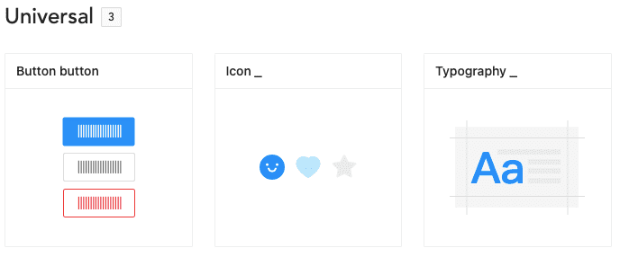
Universal Components: Buttons, icons, typography, etc.
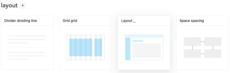
Layouts: Grids, layouts, spacing, etc.
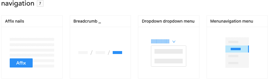
Navigation: Breadcrumbs, menus, dropdown menus, etc.
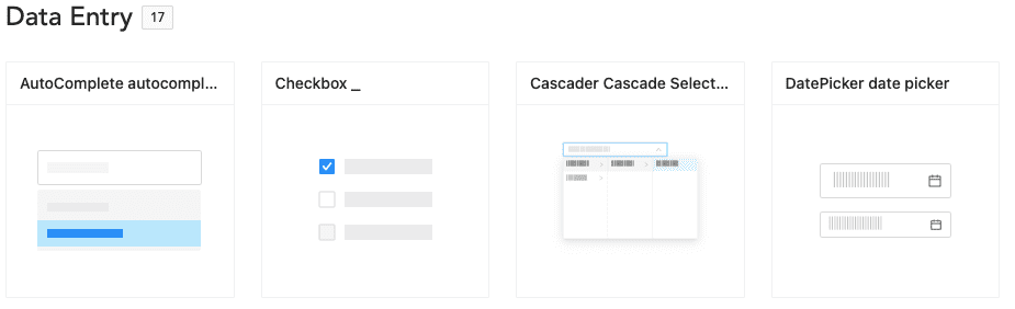
Data Entry: Autocomplete, checkbox, date picker, etc.
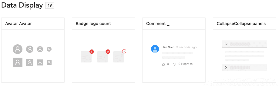
Data Display: Avatar, comments, collapsible panels, etc.
Installing React and Ant Design
Now that we know what components are available in Ant design, let’s learn the basic installation process of React and then install Ant design in it.
You can use yarn or npm to set up the React project. Below are the basic commands to install and set up React:
$ yarn create react-app antd-demo

# or

$ npx create-react-app antd-demo

$ cd antd-demo
$ yarn start
Once React is installed, you can see the running app in the browser.
This is the default generated directory in the newly created project. Going forward, we will be modifying some of the files here to achieve the final output.
├── README.md
├── package.json
├── public
│   ├── favicon.ico
│   └── index.html
├── src
│   ├── App.css
│   ├── App.js
│   ├── App.test.js
│   ├── index.css
│   ├── index.js
│   └── logo.svg
└── yarn.lock
Now after setting up React, let’s install Ant design in it with this command:
$ yarn add antdAfter installing antd, you can use the Ant components by modifying the markup in App.js that is inside the src folder in your project. Here, I am adding a button element from Ant.
import React from 'react';
import { Button } from 'antd';
import './App.css';

const App = () => (
  <div className="App">
    <Button type="primary">Button</Button>
  </div>
);

export default App;
Ant button component:

Once you save and run the app, you will be able to see the Ant primary button element in the browser in blue color (as shown above). This means that Ant is successfully integrated in React.
Customizing a Theme
The best part about integrating Ant Design with React is that it allows you to customize your design tokens to satisfy UI diversity from business or brand requirements, including primary color, border radius, border color, etc.
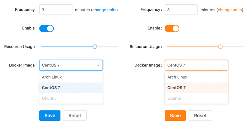
Image credits : Intoli
To allow these customization, you will need to do some advanced configurations.
Advance Configuration:
At this point you need to customize the default configurations of create-react-app. Let’s use CRACO (Create React App Configuration Override) - a community solution for custom configuration of create-react-app.
Step 1: You will first need to install CRACO and replace the default React-script with CRACO in package.json.
$ yarn add @craco/craco

/* package.json */
"scripts": {
-   "start": "react-scripts start",
-   "build": "react-scripts build",
-   "test": "react-scripts test",
+   "start": "craco start",
+   "build": "craco build",
+   "test": "craco test",
}
According to the requirements of configuring the theme, the custom theme needs to use the Less variable override function similar to that provided by less-loader. We can introduce Craco-less to help load less styles and modify variables.
$ yarn add craco-lessStep 2: Modify the src/App.css file to src/App.less, and import antd.less file over antd.css in app.less
/* src/App.js */
- import './App.css';

+ import './App.less';

/* src/App.less */
- @import '~antd/dist/antd.css';

+ @import '~antd/dist/antd.less';
Step 3: Create craco.config.js in the root directory to modify the default configuration.
const CracoLessPlugin = require('craco-less');
module.exports = {
  plugins: [
    {
      plugin: CracoLessPlugin,
      options: {
        lessLoaderOptions: {
          lessOptions: {
            modifyVars: { '@primary-color': '#1DA57A' },
            javascriptEnabled: true,
          },
        },
      },
    },
  ],
};
Here, less-loader is modifyVars used for theme configuration.

If you see a green button, you know the configuration is successful. Now you can customize the theme with your own set of colors using the tokens/variables provided.
Ant Design Style Variables
Below are some of the most commonly used generic variables. You can visit here to get details on all the available style variables.
@primary-color: #1890ff; // primary color for all components
@link-color: #1890ff; // link color
@success-color: #52c41a; // success state color
@warning-color: #faad14; // warning state color
@error-color: #f5222d; // error state color
@font-size-base: 14px; // major text font size
@heading-color: rgba(0, 0, 0, 0.85); // heading text color
@text-color: rgba(0, 0, 0, 0.65); // major text color
@text-color-secondary: rgba(0, 0, 0, 0.45); // secondary text color
@disabled-color: rgba(0, 0, 0, 0.25); // disable state color
@border-radius-base: 2px; // major border radius
@border-color-base: #d9d9d9; // major border color
@box-shadow-base: 0 3px 6px -4px rgba(0, 0, 0, 0.12), 0 6px 16px 0 rgba(0, 0, 0, 0.08),
  0 9px 28px 8px rgba(0, 0, 0, 0.05); // major shadow for layers
Vinit Kumar
Related Insights
Don't Miss Out!

