With each passing year, development in the field of web design is witnessing extensive changes. Thus, it becomes important to catch up with the growing trend, rather than subsiding with the same old practices. Now, with high expectations from the user, when it comes to User Experience, it becomes necessary to raise the bar and come up with state of the art digital experiences.
Here are some of the top trends to follow that are sure to enhance the User Experience and create an impact among the visitors.
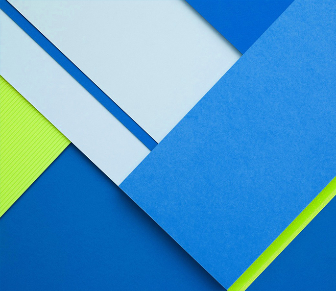
Flat 2.0 or Google’s Material Design?
For years now, we have had this ongoing controversy on Flat Design Vs Skeuomorphism. One trend that puts an end to this is Flat 2.0. Imagine the combination of elements of Flat, along with subtle shadows, highlights and layers; that’s Flat 2.0 for you. Flat 2.0 introduces bright colours, flat buttons and simple body copy styles which give room for images and call to actions. The result is that the User Experiences an interface which is easier to navigate.
Just when the critics were arguing about how the flat design has gone too far by removing most of the skeuomorphs, enter Google’s Material Design. It consists of countless intriguing features. But one thing that sets this apart from the others is its use of Z-axis. It is designed to be universally acceptable and responsive to all types of screen shapes and sizes.

Get Innovative with Videos
One of the well-known ways to create an intriguing User Experience is to make use of videos. Usage of videos gets the visitors engaged quickly. However, videos have been a part and parcel of User Experience for over a decade now. It is crucial as to how to make use of videos in the changing trend!
To make videos exciting, it is important to take things beyond interviews, how-to or product demo videos. Introduction of background videos has had a great impact on users. With video backgrounds, the video becomes a part of User Experience providing the designer with better and engaging ways to communicate with the user.
Utilizing an online video creator tool adds another layer of creativity and convenience to the process. These tools empower users to effortlessly create captivating videos by offering various features, templates, and effects.

Rich and Advanced Animations
The trend of animation began with CSS3 transitions, and from there, it has traversed a long way in web applications. Now, while numerous CSS and JavaScript Libraries are presently dedicated to animation, animation has become a requisite to enhance a website’s experience..
However, proper usage of animations is an important factor. Based on the target audience and industries, using animations in a smart way improves the interface without being the distracting or disturbing element of a page.

Screen Is Not the Only Focus Anymore
Just a couple of years back, User Experience was mainly based on the screens. May it be desktops, laptops, tablets or smart phones, screens were the only way for users to get connected and interact. Today, technological advances; such as virtual reality, wearable technology and augmented reality, have rattled the conventional approach of UX designs.
The need for a fluid responsive design has cropped up with these technological advances. Responsive designs provide smoother User Experience, irrespective of the platform used. Thanks to various themes available through CMS such as WordPress, Drupal, and Adobe; development of responsive designs, even for the least experienced designers and developers, have become easy now.

Automatic Task runners
A handful of new and automated practices has changed the world of front-end development to a great extent. One such practice is the use of task runners/build systems like Gulp and Grunt. These task runners are used to perform various tasks that previously required manual effort.
Over the years, machines have advanced to such an extent that they tend to make very few mistakes. So, the more you can automate your task, the lesser issues you will have.

AI – Key to interactive future
As Artificial Intelligence (AI) blends itself among various products, the world is coming in terms with the reality that AI is the most sought after thing right now. With Apple’s ‘Viv’, Google’s ‘Google Now’ and many other AIs at our doorstep, designers realize that they need to study the human behaviour keenly if they want to provide the right choices for their users.
With Artificial Intelligence, comes interactive designs that are less about responding to a user’s request, but more about delivering the needs they haven’t expressed yet! As the line separating Artificial Intelligence and natural life continues to diminish, designers need to create things that feel and act real resulting in smarter objects and environments.
With access to multiple AIs, these intelligent assistants need to be ‘helpful’ to one another. As individual AI companies fail to cooperate with one another in this competitive world, it’s up to the designers to deal with this and create designs that ease the heated relationship between various AIs in the near future.

Shri Ganesh Hegde
Don't Miss Out!