Drupal theming has been an area long untouched by a radical update. Sure there are tons of contributed modules available for making the workflow a little easier but the out-of-the-box approach for creating a custom theme has remained more or less the same. There has been chatter about having some sort of component-based theming mechanism inside Drupal core itself for a long time. Enter Single Directory Components (SDC), which has been in discussion for quite some time through a contributed module handled by prominent Drupal contributors - Mateu Aguiló Bosch, Mike Herchel, Lauri Eskola, and Dave Reid. But now it has entered the core of Drupal (currently as an experimental feature) in version 10.1.
This component-based approach of theming a Drupal application isn’t new but it finally has made it to the core. It gives a whole new frontier for front-end devs to organize their code in a way that is more maintainable with a minimal learning curve. Within SDC, all files necessary to render the component (Twig, CSS, JS, etc.) are grouped together in a single directory. SDC has the potential to revolutionize front-end development in Drupal by empowering developers to leverage the latest front-end techniques, solidifying Drupal’s position as a robust and forward-looking CMS.
Drupal's current theming approach
The simplest way to work on a Drupal theme has been to add the markup to the html.twig files inside the template folders. For styling and behavior, we create CSS and JS files according to an entity's need and place them inside the CSS and JS folders respectively. This includes theming header menu, footer menu, blocks, regions, individual content types and their different view modes, different views, etc. These files are then declared in the libraries.yml file where dependencies (if any) can also be mentioned. This way they can be loaded on demand or be made globally available. Apart from this, any preprocessing logic goes into the .theme files, we have the breakpoints.yml to help with responsive designs and of course, .info.yml file without which all the effort is a waste.
While this seems to be a lot of work to be done before we actually do some useful frontend work, there have been some boilerplate code generators like drush theme generate, which intend to generate the folder structure of a theme in an interactive way and create a standard drupal folder structure.
Even though the above structure works well enough for starting a project and can pose no issue for a small project, it can become a bottleneck for enterprise websites where a more sophisticated design system needs to be integrated.
- Things start getting cluttered very rapidly. We see a lot of CSS and JS files just filled up to the brim in their folders.
- Developers struggle to find the code they can reuse or extend.
- Issues like code duplication, code spread across the files, specificity hell, and CSS conflicts crop up.
- This often leads to more efforts spent on later development where it is expected that initial development would have helped later.
Our approach to theming in Specbee
At Specbee, we have standardized how we create our themes using an NPM tool called Drupal Theme Init developed by us from scratch which is open-sourced. Being a Yeoman generator, it can easily be installed with NPM/Yarn which then interactively helps in the generation of a custom theme. The idea of the Drupal Theme init is to have a consistent approach to how theme files are scaffolded following Drupal practices and to help out developers to start working on the theme without the hassle of setting the files every time they start a new project. The basic idea of the structure is to compartmentalize SASS into components using the BEM convention. Each CSS files associated with an entity like block, view, content type, etc have its own CSS generated and is attached to that entity either through the twig template or preprocessing. The same goes for the JS files. The extensive use of libraries.yml helps us to limit the amount of CSS and JS we render on the page.
The advantage of setting up the theme this way is we have a system in place for component-based theming without depending on any external libraries or plugins. It helps us to segregate the CSS/JS libraries based on the components to be loaded on the page, which helps with the performance. However, there are still limitations to this approach especially when the project grows in size. The segregation of components into atomic levels becomes a bit of a burden as it requires us to maintain the libraries.yml file with required dependencies. Also, there is no easy way we can do a proper integration of a design system with the current structure easily as we will have to define each component path and its dependency by ourselves in the design system too, to load the components in it.
What is Component-based theming
While the vanilla approach seems fairly basic, there have been huge amounts of advancements done in recent times through contributed modules to have better approaches. One of the popular approaches is imagining the UI as a collection of reusable and consistent units called components. In most cases, this follows Atomic Design where each component is segregated into smaller building blocks. Modules like UI Patterns, Components! or component libraries like PatternLab, Fractal, and Storybook have brought innovative ways which have made the development of themes more streamlined and robust. Component-based theming has a certain edge over traditional theming:
- One of the biggest bottlenecks is the backend dependency, where frontend work can't start without the Backend work. This creates a lag. Using a component-based approach, the front-end can work independently and without much deep knowledge of Drupal things.
- Components can be created just from the available design with the required placeholders. The values for these placeholders can be filled later when the backend work is completed
- It creates a workflow where we just don’t change the markup in the templates folder and style it as per the requirement. Rather we have smaller structures styled separately and then create a collection of these smaller units into bigger components that can be used by the Drupal templates.
- This helps in maintaining the code related to each component in isolation and creates lesser chances of side effects.
- It confirms UX consistency across the application.
- Helps in the reduction of efforts spent on setting up the feature as changes made in one place reflect across the areas where it is used.
How to do component-based theming in Drupal
One of the prominent ways of following component-based development is using PatternLab which was introduced quite a while back. It initially came in with a Drupal edition which is archived now and replaced by a node-based package. The setting up of the PatternLab requires a Components module to be installed which will help in getting the markup from Twig files outside the templates folder for Drupal. This is followed by installing the patternlab package via npm which gives options to generate twig or mustache-based templates (obviously twig for us). Once this is done we have a ready reckoner style guide, some boilerplate code that helps in the creation of the style guide, and a patterns folder where in we create the components according to the requirements. These components are then included in the html.twig files present inside the templates folder.
While all these steps are fine to perform, there are instances where this is a bit difficult to set up and has a bit of a learning curve to it. The biggest drawback that comes with Patternlab is that all the CSS is aggregated into a single file which then gets dumped into all the pages (which is sometimes also the case with the JS included with it). While this doesn’t matter initially as the basic idea is the reusability of the component, once the project grows this starts affecting the page performance.
How to do component-based theming with SDC
With the initial version of SDC going into the core as an experimental module, there has been a lot of excitement around it. SDC has been touted as the biggest change to Drupal theming since the introduction of Twig. SDC again is not a complete solution for the Frontend Development team but a component-driven approach to theming with an out-of-the-box basic structure. This can still be extended with a number of modules for a certain kind of workflow. The basic idea is everything related to a component stays inside a single directory. This includes the Component Twig file, JS, CSS, other assets, and a single schema YAML file declaring the properties of the component.
Some immediate benefits of using SDC:
- All the code related to a component is in a single directory (as the name suggests!).
- The libraries for the component are auto-generated which leads to lesser trauma of not declaring the it in libraries.yml file. Although we still might need to add the dependencies to the component.yml file, this is being done in a single place rather than jumping to the libraries.yml file.
- There is a far smaller learning curve to implement SDC. If you know the basic of Drupal theming, all you need to do is enable this module and start writing the components.
- The power of twig (include/extend/embed) is still available which helps in the reusability of code.
- As the components are YML plugins, which can be easily discovered by Drupal and can be easily swapped by a component having the same API structure.
- The components can also be rendered through render arrays!
- Provides a good mechanism to integrate external libraries to facilitate a Design system.
- As the components are organized, the result of that is a consistent look and feel of the end product.
- The code becomes more testable as we have units (read components) that can be tested independently
- Because we define the schema within a component’s YAML definition, modules can automatically create forms to populate data.
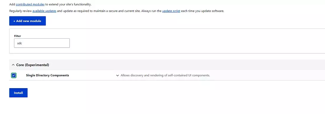
Though it is currently included as an experimental feature in the core, setting up SDC is quite easy. Assuming there is a Drupal 10.1.x installation:
1. Enable the experimental SDC core module.
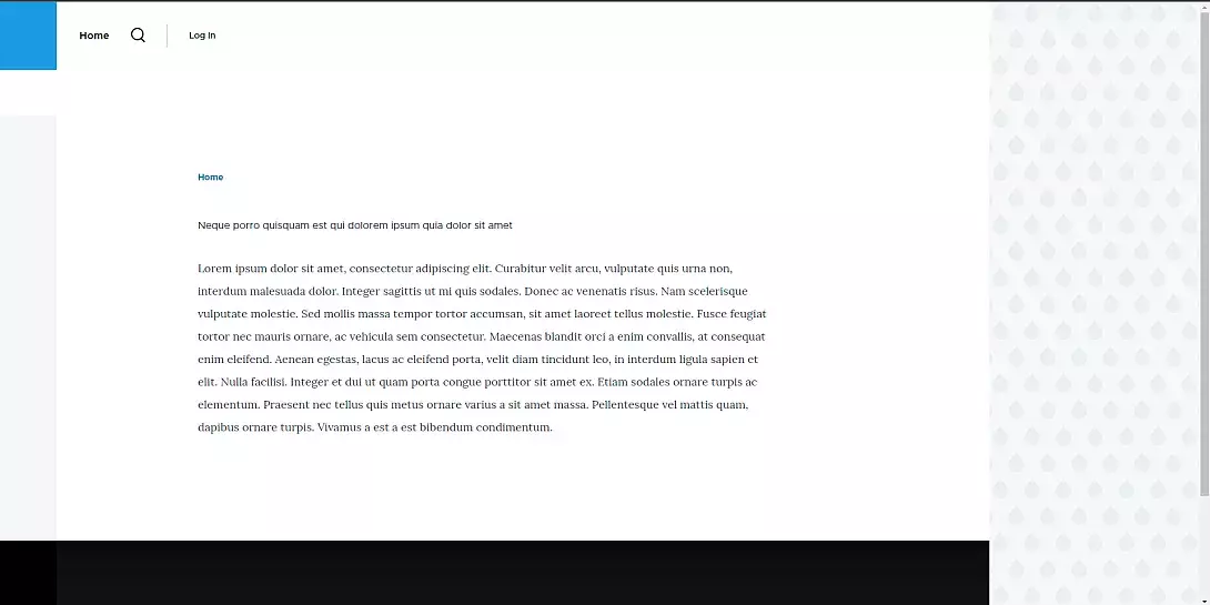
2. Create or use a custom theme to add SDC. For our purpose we created a custom theme called Ice Cream with Olivero as base theme.
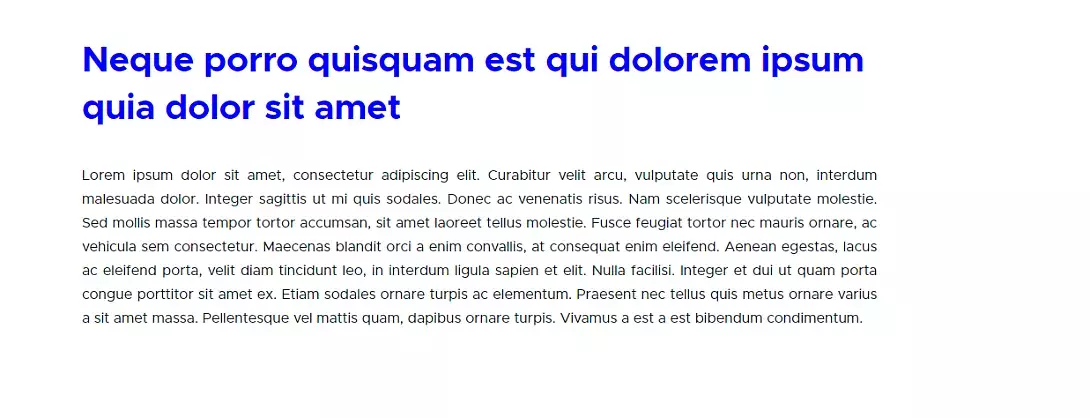
3. For our purpose, let's use the basic page which comes out of the box. I have repurposed it by adding a custom Title field and making some adjustments to the display which then looks like this:
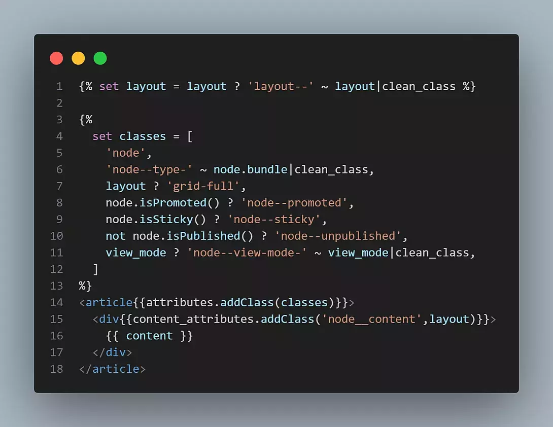
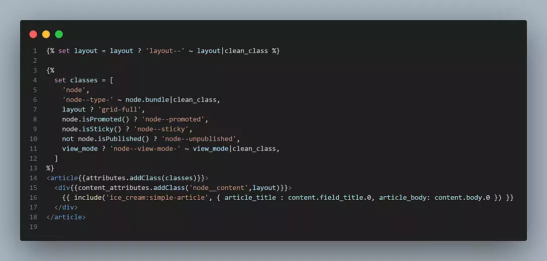
4. The template twig file consists of basic code:
5. Create a folder called components inside your custom theme. This is similar to how we have a templates folder for Drupal templates.
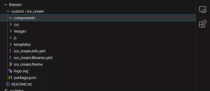
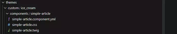
6. For now, the basic idea is to style the title and description, which will be reusable in nature. Let's create a component called simple-article. There will be simple-article.component.yml file and simple-article.twig which we will require. Apart from that, we will also add simple-article.css for styling.
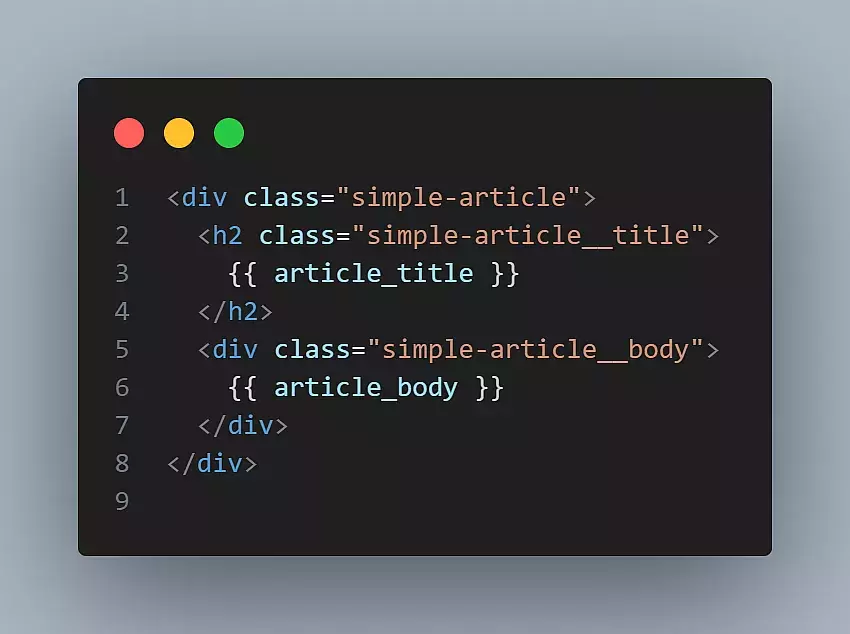
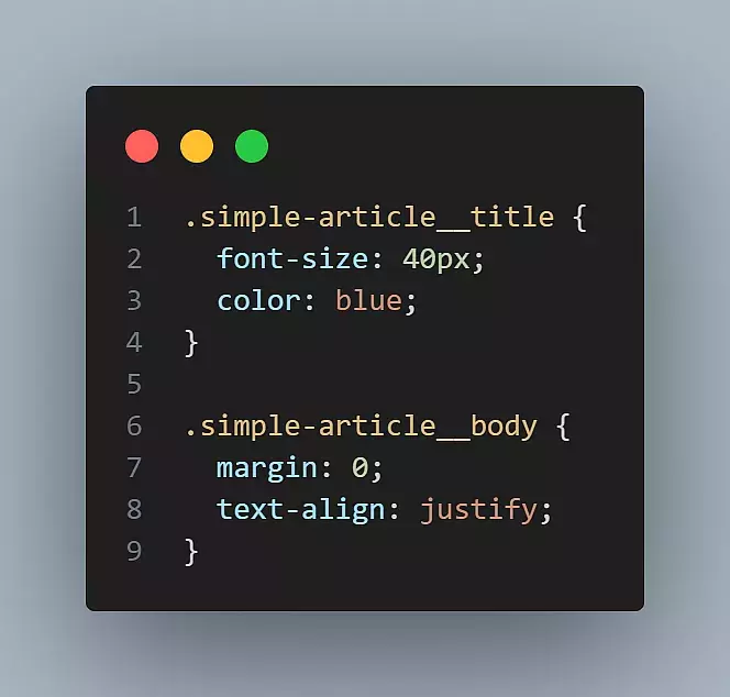
7. Let's create the simple-article.twig file. We will have a basic markup for that.
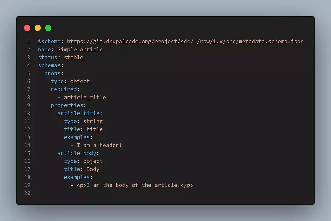
8. Add the simple-article.component.yml file with the schema mentioned in https://www.drupal.org/node/3352951. The idea is to define what will be the inputs to the twig file. It will look something like this for us:
9. Let’s add some basic styling to the component in simple-article.css.
10. Clear the cache.
11. Abracadabra! The component is now ready to use. But it still needs to be used. Without that, the component sits idle in the components folder.
12. Include this component in the required template file (this is the html.twig file under the templates folder in the custom theme) with format [theme_name:component-name]. Notice the include statement where we are adding the twig variables to be used in the component.
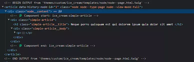
13. The component now gets rendered with our new markup and better styling.
14. Notice the markup. If twig debug is enabled, we get some special icons too with our SDC component rendered.
And that’s it!
References
- https://www.drupal.org/docs/develop/theming-drupal/using-single-directory-components/about-single-directory-components
- https://www.drupal.org/project/sdc
- https://herchel.com/articles/creating-your-first-single-directory-component-within-drupal
Final Thoughts
With the way SDC has been built, there is going to be high-intensity development around it. One of the popular tracks is that modules will automatically detect components and insert their respective forms into Layout Builder, CKEditor, Paragraphs, Blocks, Fields, etc! In addition, SDC right now plays nice with Storybook through a contributed module called CL Server (which has been maintained by SDC project maintainers). Already there are other modules like CL Devel, CL Generator, and even UI Patterns that are getting built around SDC.
This will also help us to upgrade our own theme generator (Drupal Theme Init) which we discussed earlier to give an option of using SDC along with a Design System in place, preferably Storybook. This will help anyone to kickstart SDC implementation instantly paving the way for better theme development.
If you would like to read more such interesting content on Drupal, subscribe to our weekly newsletter today!

Sagar Chauhan

Malabya Tewari
Related Insights


Don't Miss Out!

