Fed up with the hassle of finicky CSS positioning and floats for organizing your page layout? They don't always play nice with all browsers. It's time for a smoother solution! Let’s talk about the brand new module - CSS Grid or Grid Layout that brings a two-dimensional grid system to CSS.
This grid-based layout system is a versatile way of organizing your content, with rows and columns, making it easier to design complex layouts. Check out the rest of the blog for insights on CSS Grid Layout and integrating the CSS Grid Layout Drupal module into your project.
CSS Grid Terminology
Similar to CSS Flexbox, where we have flex containers and flex items, in CSS Grid, we follow a similar concept with grid containers and grid items. To turn a container into a CSS Grid container, we simply set its display property to “Grid”.
Grid Container: The grid container wraps all the grid items within its area.
Grid Cell: Each individual item inside the grid container is referred to as a grid cell or grid item.
A Grid layout forms a two-dimensional structure, with columns along the Y-axis and rows along the X-axis.
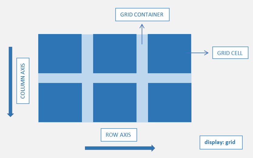
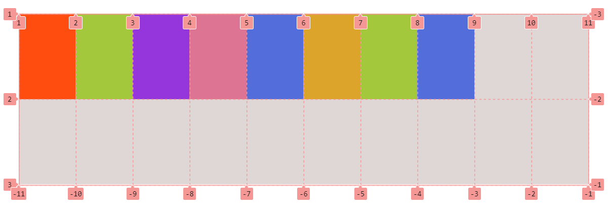
Grid Line: The vertical and horizontal lines that divide the grid into columns and rows are called grid lines. They are automatically numbered for columns as well as for the rows starting from 1 all the way to the number of rows or columns plus 1.
Grid Gap: The space between Grid cells is called a gutter or Grid Gap.
Grid Track: Grid items aligned in a row or column are referred to as a grid track. For horizontal alignment, we use the term "row track," and for vertical alignment, it's called a "column track."
Grid Area: The area between two vertical and horizontal lines is called grid area.
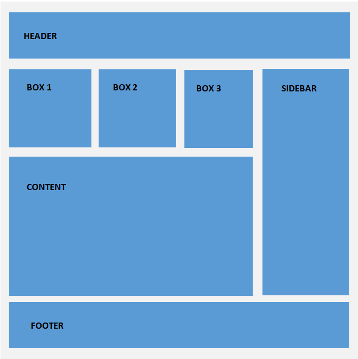
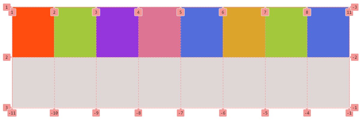
Demonstration of row and column values and properties
HTML
<div class="wrapper">
  <div class="header">Header</div>
  <div class="box-1">Box 1</div>
  <div class="box-2">Box 2</div>
  <div class="box-3">Box 3</div>
  <div class="main-content">Main Content</div>
  <div class="sidebar">Sidebar</div>
  <div class="footer">Footer</div>
</div>
CSS
.wrapper{
  display: grid;
  grid-template-rows: 100px 200px 400px 100px;
  grid-template-columns: repeat(3, 1fr) minmax(200px, 1fr);
  grid-gap: 30px;

  // Line names
  grid-template-rows: 100px [box-start] 200px [box-end content-start] 400px [content-end] 100px;

  // Grid area names
grid-template-areas: "head head head ."
                   "box1 box2 box3 side"
                   "main main main side"
                   "foot foot foot foot";
}

// Using Line numbers
.header{
  grid-column: 1 / -1;
}

.main-content{
  grid-row: 3 / 4;
  grid-column: 1 / 4;
}

// Using Line Names
.sidebar{
  grid-row: box-start / content-end;
}

// Using Grid Area Names
.footer{
  grid-column: foot;
}
Grid Properties
For making an element a grid container, we use display:grid
grid-template-row - Defines the number of rows in a grid layout.
grid-template-column - Defines the number of columns in a grid layout.
row-gap & column-gap - Defines the gap between grid row and grid column individually.
grid-gap - Defines the gap between both rows and columns respectively in a grid layout.
The Repeat function - It is employed to express a recurring segment of the tracklist, enabling the concise notation of a repetitive pattern for a substantial number of columns or rows.
The Fr unit - A fractional unit that dynamically calculates layout divisions. With 1fr, you get one share of the available space within the grid.
Naming Grid Lines - Give names to specific or all lines in your grid while defining it using the grid-template-rows and grid-template-columns properties.
Naming Grid Areas - The grid-template-areas CSS property specifies named grid areas, establishing the cells in the grid and assigning them names.
grid-row - The grid item's start and end position within the grid row.
grid-columns - The grid item's start and end position within the grid column.
min-content - The property specifies the intrinsic minimum width of the content.
max-content - The property specifies the intrinsic maximum width or height of the content.
minmax - Defines a size range greater than or equal to min and less than or equal to max content.
Browser inspector view for grid - align and justify items and content
HTML
<div class="container">
  <div class="item item--1">Modern</div>
  <div class="item item--2">CSS</div>
  <div class="item item--3">with</div>
  <div class="item item--4">Flexbox</div>
  <div class="item item--5">and</div>
  <div class="item item--6">Grid</div>
  <div class="item item--7">is</div>
  <div class="item item--8">Great</div>
</div>
CSS
 .container{
  display: grid;
  grid-template-rows: repeat(2, 150px);
  grid-template-columns: repeat(2, 300px);
  grid-auto-flow: row;
  grid-auto-rows: 150px;
  grid-gap: 30px;

  // Aligning content in row direction
  align-content: center;

  // Aligning content in column direction
  Justify-content: center;

  // Aligning items in row direction
  align-items: center;

  // Aligning items in column direction
  justify-items: center;

  .item{
    &--2{
      grid-row: 2 / span 2;

      // Aligning item in row direction
      align-self: center;

      // Aligning item in column direction
      justify-self: center;
    }
  }
align-items - Align Grid items inside the grid cell or area in the column/vertical axis.
justify-items - Align Grid items inside the grid cell or area in the row/horizontal axis.
align-self - Overrides the grid item's align-items value and aligns itself inside the cell/area in the column/vertical axis.
justify-self - Overrides the grid item's justify-items value and aligns itself inside the cell/area row/horizontal axis.
align-content - Specifies how the grid content is distributed along the column axis / vertically in a grid container.
justify-content - Specifies how the grid content is distributed along the row axis / horizontally in a grid container.
grid-auto-flow - The property regulates the direction in which auto-placed items are inserted into the grid, either in the row or column direction. The default value is row.
grid-auto-rows - This property sets a size for the rows in a grid container.
grid-auto-columns - The grid-auto-columns property sets a size for the columns in a grid container.
auto-fill - This property fills rows with as many columns as possible, even if the added column is empty, occupying space in the row.
Browser inspector view for grid auto-fill property
auto-fit - It fills rows with as many columns as possible. It collapses empty cells, setting their width to 0 to prevent excess space.
Browser inspector view for grid auto-fit property
Implementing the Drupal CSS Grid layout module
The Drupal CSS Grid Layout module seamlessly integrates the power of CSS Grid into your Drupal environment, providing a flexible and efficient way to structure and organize content.
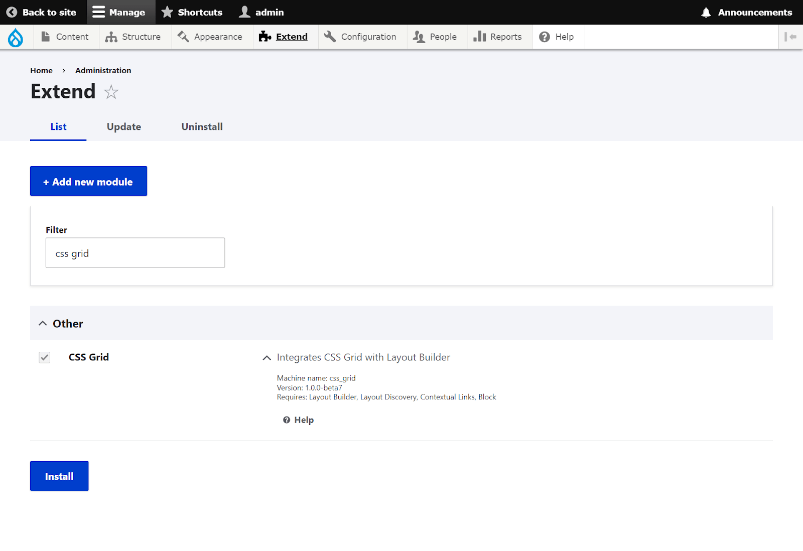
Installing the module
Prerequisites:
- Layout builder
- Layout Discovery
Install CSS Grid Layout module using
- composer require 'drupal/css_grid:^1.0@beta'Next, enable the module here: Administration > extend
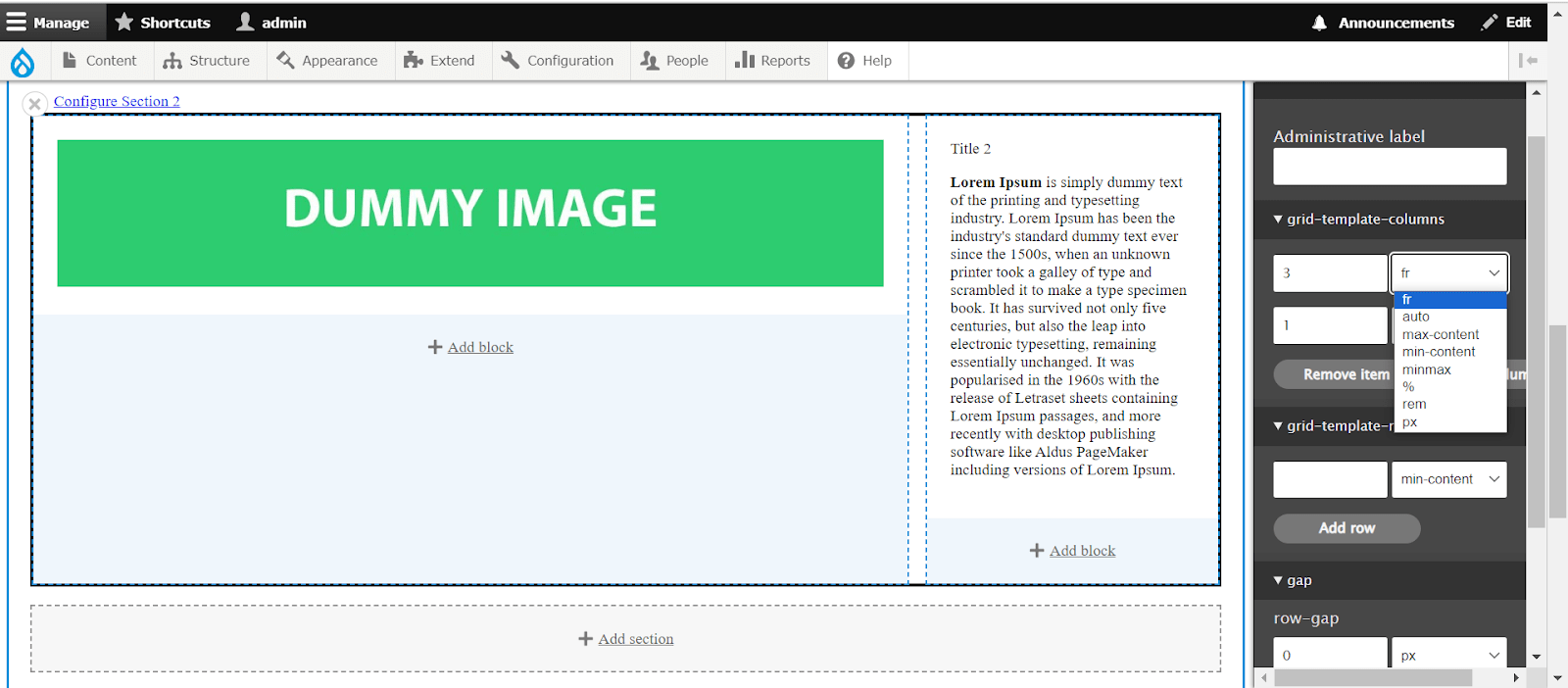
Add a new layout builder page:
Content → add content → Layout builder page → layout → Add section
Now you have yourself a newly created layout CSS Grid.
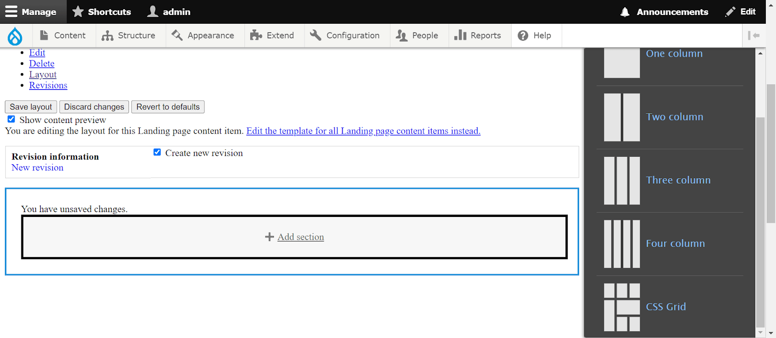
Choose CSS Grid, and you'll find options for columns, rows, and gaps, allowing you to create a dynamic grid layout.
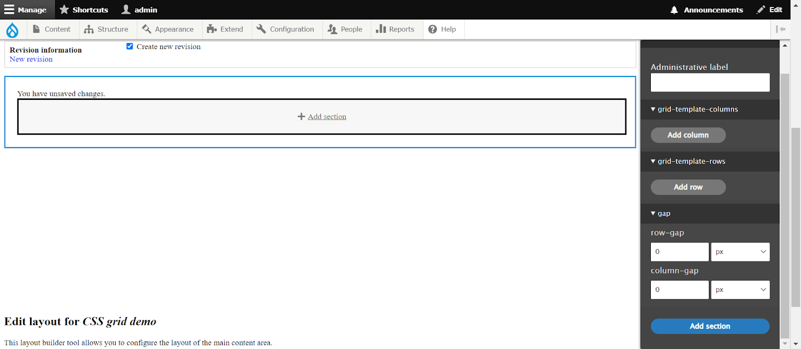
You can then incorporate column, row, and gap values according to the desired structure.
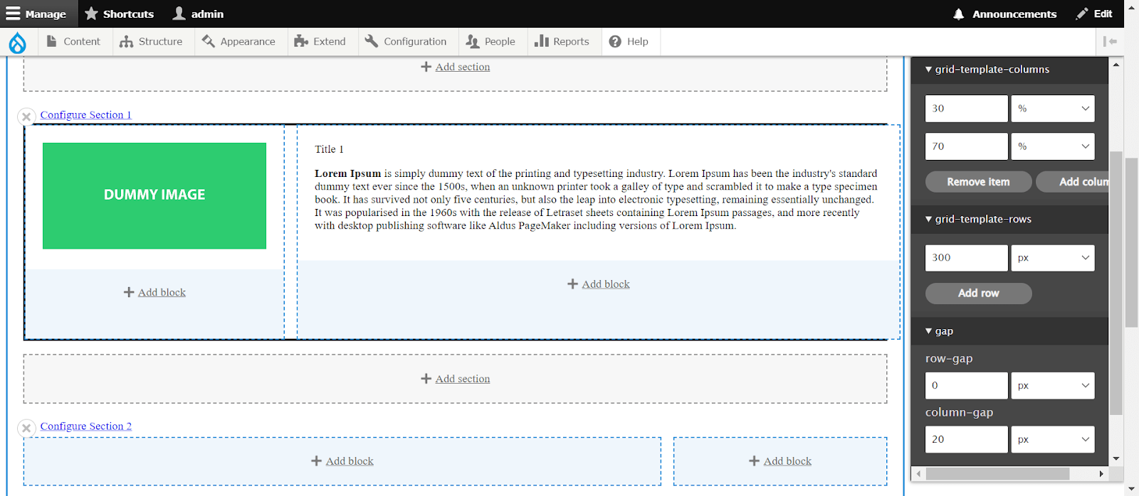
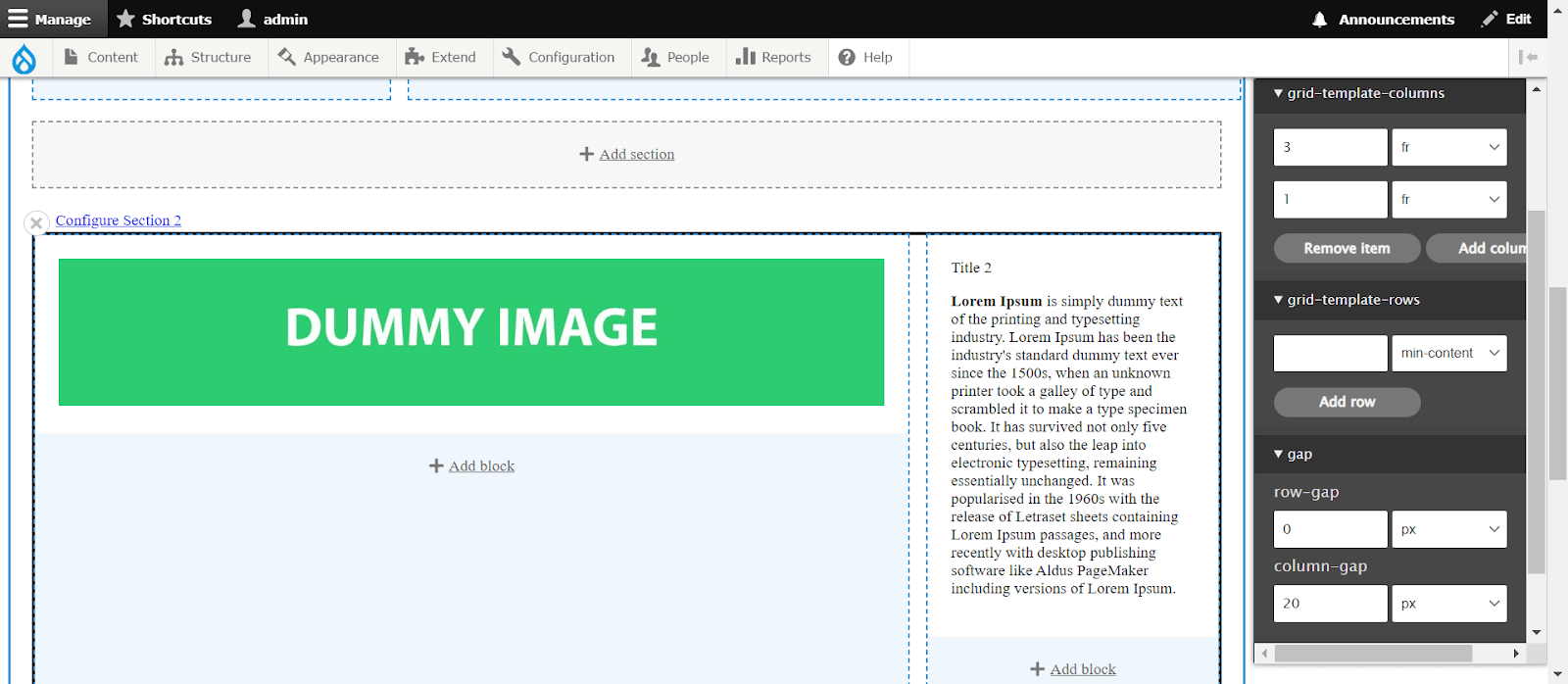
You can also choose from different CSS and grid layout units.
Final Thoughts
These are the fundamental aspects of the CSS Grid layout algorithm. Armed with this knowledge, you can construct intricate and interactive layouts, eliminating the reliance on CSS frameworks. For Drupal frontend developers, the integration of the CSS Grid Layout module adds an extra layer of flexibility and enables seamless implementation and customization of grid-based designs within Drupal. If you're ready to implement these cutting-edge design techniques into your Drupal website, explore our Drupal services for seamless integration and customization.

Aamir Khan
Related Insights


Don't Miss Out!

