In the world of web development, responsive design has become a cornerstone of creating user-friendly and visually appealing websites. CSS media queries have long been the go-to solution for adapting layouts to various screen sizes. However, as web design and user expectations have evolved, the limitations of traditional media queries have become apparent. This is where CSS container queries come to the rescue.
In this article, we'll explore CSS container queries, how to use them, and the limitations of traditional approaches.
What are CSS Container Queries
CSS Container queries is a component-driven styling approach where the styling of the component is based on the container in which the component is present. Instead of relying solely on the viewport dimensions, container queries enable CSS rules to adapt dynamically to changes in the container they are applied to.
This lets the components modify their appearance to fit the context in which they’re put. This is not always related to the viewport’s size but sometimes also where the component is placed in the layout. Not just the positioning of inner elements, but even their styling can change with these queries. This helps in component reusability without code duplication.
The first implementations of this spec came in 2021 and have become relatively stable in major browsers. Currently, they are supported in recent versions of Chrome, Firefox, Safari, Edge, etc.
Beyond Media queries
CSS media queries are incredibly powerful and have allowed developers to create flexible and adaptive layouts. They enable us to apply different styles based on the device's screen width, height, or aspect ratio. While this approach works well for simple cases, it falls short when dealing with component-based designs.
The problem arises when a container (such as a `div`, `section`, or `article`) changes its size dynamically due to its content or the overall layout adjustments. Traditional media queries depend on the viewport size and not on the size of individual containers. As a result, developers have had to resort to JavaScript workarounds or rely on complex CSS rules to achieve desired results.
Exploring Flex and Grid
Developers still use certain CSS grids and flex behaviors to approximate container responsiveness. Some of the properties that can be useful for responsiveness are:
- “flex-wrap” can be used to move items to the next line in case we don’t have enough space without writing a media query.
- “flex-grow” and “flex-shrink” allow the element to grow or shrink proportionally without explicitly mentioning the width of each element.
- Similarly grid allows us to use “fr” units and “minmax” functions to adaptively size the contents inside the grid structure.
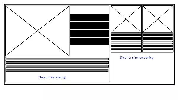
The following is the behavior of flex-wrap when there is a change in the size of the parent container.


Limitations of Flex and Grid
Flex and Grid are restricted to defining layout adjustments from horizontal to vertical arrangements, and don’t address the need to modify other properties. A lot of times they depend on the viewport media queries for responsiveness which basically helps with components that are full-width.
For example, we can give a property like a flex-wrap for the children to move to the next line in case the flex box cannot accommodate all the children. But we cannot change any other property like font-size or number of elements per row when the wrapping occurs.
Component behavior with Container Queries
Container queries help in styling the same component for various component sizes. As we can see below the smaller version of the component automatically adjusts the elements and their spacings based on the container size in the same viewport.
CSS Rules for Container Queries
The proposed CSS `@container` rule is the foundation of container queries. It allows developers to create context-specific rules that apply to the targeted container. The syntax is somewhat similar to media queries, with a slight difference in how the container's dimensions are referenced.
container-name: A custom name that can be given to the container.
.wrapper {
 container-name: my-wrapper;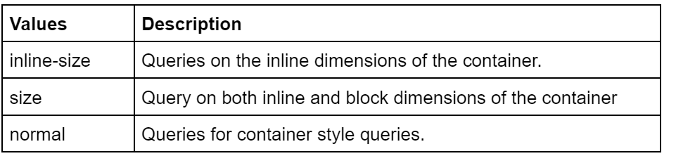
}container-type: This defines the type of containment used in a container query which currently is supported by 3 values.
.wrapper {
container-type: inline-size;
}
container: Shorthand way of combining rules for container-name and container-type.
.wrapper {
 container: my-wrapper / inline-size;
}@container: The query inside which the element styling changes as per the parent container properties.
.wrapper {
 container: my-wrapper / inline-size;
}
@container my-wrapper (min-width: 700px) {
 h2 {
   font-size: 52px;
 }
}
Working with Container Queries
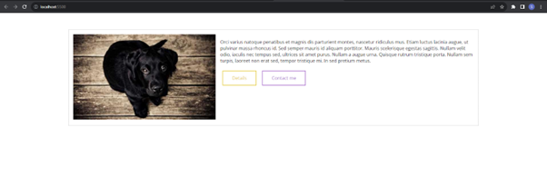
In the following demo, we see there is a simple card with an image, some text and a couple of buttons which are arranged in a certain way for the given resolution.
index.html
<div class="card-container">
           <div class="card">
             <div class="card__media">
               <img
                 class="card__img"
                 src="https://picsum.photos/id/237/500/300"
                 alt="Some image"
               />
             </div>
             <div class="card__body">
               <p>
                 Orci varius natoque penatibus et magnis dis parturient montes,
                 nascetur ridiculus mus. Etiam luctus lacinia augue, ut pulvinar
                 massa rhoncus id. Sed semper mauris id aliquam porttitor. Mauris
                 scelerisque egestas sagittis. Nullam velit odio, iaculis nec
                 tempus sed, ultrices sit amet purus. Nullam a augue urna.
                 Quisque rutrum tristique porta. Nullam sem turpis, laoreet non
                 erat sed, tempor tristique mi. In sed pretium metus.
               </p>
               <button class="up" type="button">Details</button>
               <button class="fill" type="button">Contact me</button>
             </div>
           </div>
         </div>

style.scss

.card {
  display: flex;
  flex-direction: row;
  gap: 1rem;
  border: 1px solid #ccc;
  padding: 1rem;

  &__media {
    flex-shrink: 0;
  }
}
On addition of another component on the left, we expect the card to stack into a better view, but without any modifications, it will look something like this:
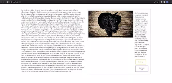
The card looks a little weird without stacking.
<div class="big-wrapper">
   <article class="article">
           Lorem ipsum dolor sit amet, consectetur adipiscing elit. Nunc condimentum dolor vel elementum dignissim. Morbi ex justo, consectetur sollicitudin nunc ornare, condimentum hendrerit diam. Nam eu lectus magna. Praesent pellentesque nibh felis, nec porttitor dui pharetra fringilla. Donec sit amet purus dui. Duis est nulla, posuere nec velit et, suscipit sollicitudin justo. Sed finibus diam ut augue dapibus auctor. Morbi pellentesque finibus mauris ac consectetur. Morbi et sagittis odio, eget pulvinar nisi. Pellentesque eu viverra velit. Donec nec ornare leo. Ut ornare quis leo a fringilla. Vivamus faucibus, justo eget lobortis rutrum, elit tellus venenatis neque, id convallis tellus tellus in neque. Etiam libero risus, blandit vitae elementum a, ultrices eu diam.

           Donec tempor eget tellus eget iaculis. Curabitur consequat blandit sapien, eget ornare diam. Cras vel imperdiet purus. Ut aliquet magna quis porttitor finibus. Vivamus eu leo odio. Suspendisse nec auctor felis. Donec mollis orci ut justo porttitor tempor. Vivamus faucibus ac lacus in fringilla. Pellentesque laoreet, risus sed mollis laoreet, erat augue vehicula nulla, non fermentum risus metus ullamcorper risus. Quisque fringilla eros id nisl accumsan fermentum. Ut elit sapien, placerat et semper in, mollis at arcu. Aenean rhoncus odio nulla, non convallis purus tristique in.

           Nulla auctor hendrerit egestas. Quisque finibus lacus ut lectus porta venenatis. Ut pellentesque nec lacus quis vehicula. Quisque vel laoreet arcu, ac tincidunt nulla. Nulla sit amet vestibulum lectus. Maecenas lectus ante, auctor et turpis in, egestas lacinia ipsum. Praesent magna lectus, facilisis nec diam vitae, tristique dictum velit. Vestibulum semper, orci consequat bibendum ultrices, turpis mauris ornare nulla, et efficitur ante lectus sit amet orci. In eget turpis sit amet justo interdum viverra vel vitae mi. Integer interdum lobortis sem, quis commodo nulla aliquet in. Nunc aliquam convallis semper. Aliquam tempus tellus eu rutrum pulvinar.

           Praesent malesuada mi in mollis imperdiet. Quisque aliquet nisi vitae quam consequat egestas. In lacus dolor, rhoncus ac augue in, ultricies facilisis felis. Praesent quis est et est feugiat sollicitudin sed sed justo. Vestibulum eu nisi et felis tincidunt posuere. Maecenas facilisis felis aliquam mi posuere, eget congue tortor placerat. Curabitur a dapibus eros, eget tempus sem. Mauris vel erat auctor, euismod nunc ac, pretium quam. Morbi iaculis, odio a facilisis convallis, mi purus venenatis justo, sit amet cursus velit risus vitae nisl. Praesent vitae faucibus mi, eu consectetur quam.

           Donec eu lacus hendrerit, auctor arcu maximus, laoreet libero. Ut imperdiet facilisis nunc. Mauris tincidunt consequat metus, a mattis tellus semper ut. Fusce vitae elit eu velit interdum molestie ac non nisi. Integer id eros non quam pellentesque hendrerit. Etiam non arcu commodo, iaculis purus sit amet, viverra tortor. Aliquam ac auctor nibh, ut efficitur leo. Fusce ut semper elit.
         </article>
         <div class="card-container">
           <div class="card">
             <div class="card__media">
               <img
                 class="card__img"
                 src="https://picsum.photos/id/237/500/300"
                 alt="Some image"
               />
             </div>
             <div class="card__body">
               <p>
                 Orci varius natoque penatibus et magnis dis parturient montes,
                 nascetur ridiculus mus. Etiam luctus lacinia augue, ut pulvinar
                 massa rhoncus id. Sed semper mauris id aliquam porttitor. Mauris
                 scelerisque egestas sagittis. Nullam velit odio, iaculis nec
                 tempus sed, ultrices sit amet purus. Nullam a augue urna.
                 Quisque rutrum tristique porta. Nullam sem turpis, laoreet non
                 erat sed, tempor tristique mi. In sed pretium metus.
               </p>
               <button class="up" type="button">Details</button>
               <button class="fill" type="button">Contact me</button>
             </div>
           </div>
         </div>
       </div>
style.scss
.card {
display: flex;
flex-direction: row;
gap: 1rem;
border: 1px solid #ccc;
padding: 1rem;
&__media {
flex-shrink: 0;
}
}
// Adding CSS for newly added
.card-container {
flex-basis: 50%;
}
.big-wrapper {
display: flex;
}
.article {
padding-inline-end: 20px;
flex-basis: 50%;
}To fix this we can add flex-wrap property to the card which will help in stacking the elements inside the card.
.card {
 display: flex;
 flex-direction: row;
 gap: 1rem;
 border: 1px solid #ccc;
 padding: 1rem;
 // Adding flex-wrap
 flex-wrap: wrap;

 &__media {
   flex-shrink: 0;
 }
}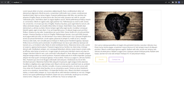
But this changes the default card behavior even if it is placed alone. There comes unwanted stacking even when the card has full width to occupy.
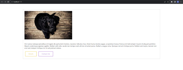
To fix this problem, we remove the flex-wrap property and introduce the container query based on the container size. This way the component behaves in a convenient manner if placed alone or in a smaller space.
style.scss
.card {
 display: flex;
 flex-direction: row;
 gap: 1rem;
 border: 1px solid #ccc;
 padding: 1rem;

 &__media {
   flex-shrink: 0;
 }
}
.big-wrapper {
 display: flex;
}
.article {
 padding-inline-end: 20px;
 flex-basis: 50%;
}
// Adding container-type
.card-container {
 flex-basis: 50%;
 container-type: inline-size;
}
// Adding container query here
@container (max-width: 750px) {
 .card {
   flex-direction: column;
 }
}
Card with Article:

Card without Article
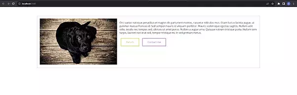
Thus, the behaviour is much better without changing the actual style of the card.
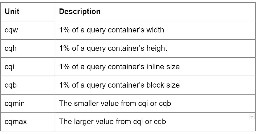
Container Units
With the advent of container queries, it was obvious that there would be some CSS units to take care of the sizes relative to the container size. The following CSS units have been brought:
Browser support
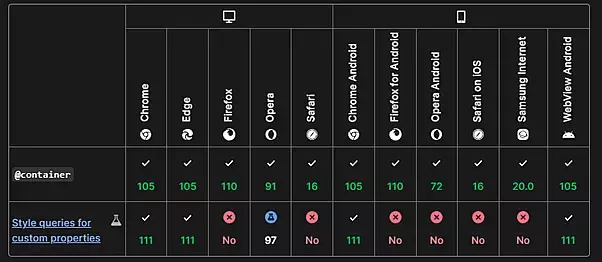
Source: MDN
Fallback
As the older browsers do not support container queries, it is recommended to use one of the following fallback options:
- Use @supports to check the availability of feature and add relevant CSS fallback eg. media queries, flex, and grid options.
- Using container-query-polyfill for using container queries as it is.
Final Thoughts
In wrapping up, it's clear that CSS container queries are more than just a solution to today's design challenges – they are a glimpse into the exciting future of web development. As technology and user expectations continue to evolve, container queries are poised to play a pivotal role in creating adaptive, user-centric websites. Embrace this innovation and stay ahead in the ever-evolving world of web design! Looking for a Drupal agency to bring your web projects to life? With a proven track record in delivering top-notch Drupal solutions, we understand the importance of responsive design and keeping up with the latest web development trends. Talk to us today!

Sagar Chauhan
Related Insights


Don't Miss Out!

