Table of contents
- Responsive Images in Drupal 9
- The Problem
- The Solution
- Steps to reproduce
- Step 1: Enable Responsive images and breakpoint module
- Step 2 : Set up the breakpoints for your project's theme
- Step 3: Set up image styles for responsive images
- Step 4: Create a responsive image style for your theme
- Step 5: Assign the responsive image style to an image field
- Final Results
- Final Thoughts
In early 2010, Jason Grigsby pointed out that simply setting a percentage width on images was not enough, and that you needed to resize these images for a better user experience (src). According to him, you can save over 75% of the weight of those images if you serve the right-sized images on a smaller screen. Ever since, the debate on responsive images has evolved into finding the best solution to render perfect, responsive images without any hassle.
Drupal 9 does a fabulous job of offering out-of-the-box solutions for responsive images (since Drupal 8). Read more about how responsive images work in Drupal 9 and learn to implement it using a simple step-by-step process.
Responsive Images in Drupal 9
When you’re confused, leave it to the browser. And that’s exactly what Drupal 9 helps you do with the help of the Breakpoints module and the Responsive images module.
But first, what are breakpoints? To be able to provide the most optimal image size for a device, you need to define different screen sizes in CSS, called breakpoints. Of course, you cannot possibly have all of them covered but you should specify some rough and reasonable sizes that could cover most devices.
The Breakpoint module is in Drupal 9 core and has some preconfigured height and width of different viewports available with the built-in themes, you can add your own breakpoints in your custom themes’ breakpoints yml file as well.
Drupal 9's Responsive image module uses a picture tag to render a flawless responsive image based on the breakpoint of the original image. The Picture module that was previously in Drupal 7 is now the new Responsive Images module in Drupal 9.
The Problem
One of the major problems with images in web development is that browsers know nothing about the images and are clueless about what sized images are rendering in relation to a viewport of different screens until the CSS and Javascripts are loaded.
However, the browser can know about the environment in which the images are rendered, which includes the size of the viewport and the resolution of the screen.
The Solution
As previously mentioned, responsive images use the picture element which basically has sizes and srcset attributes that play a major role in notifying the browser to choose the best images based on the image style selections.
Drupal 9 has done a great job in providing the responsive images module in core. This will help the browser download lower-sized images for devices with lower screen resolution, resulting in better website load time and improved performance.
Steps to reproduce
- Enable Responsive images and breakpoint module.
- Set up the breakpoints for your projects theme.
- Set up image styles for responsive images
- Creating a responsive image style for your theme
- Assign the responsive image style to an image field.
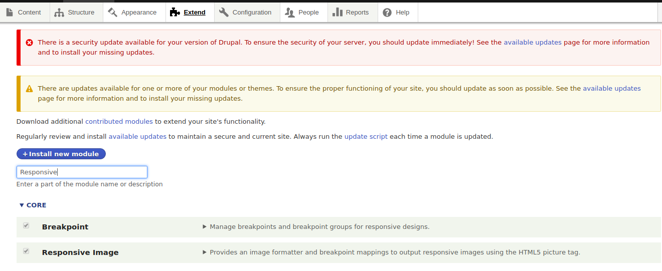
Step 1: Enable Responsive images and breakpoint module
Since both modules are part of Drupal 9 core, you will not need to install them or add any other module. All you have to do is enable the Responsive images module since the breakpoint module will be installed with the standard profile. If not, enable the breakpoint module.
To enable the modules, go to Admin->Extends, select the modules and enable them.
Step 2 : Set up the breakpoints for your project's theme
Setting up the theme’s breakpoints is the most important part of building a responsive website in Drupal 9.
comminfo.phone:
   label: phone
   mediaQuery: '(max-width: 767px)'
   weight: 0
   multipliers:
       -1x
       -2x
comminfo.tablet:
   label: tablet
   mediaQuery: '(min-width: 768px) and (max-width: 1024px)'
   weight: 1
   multipliers:
       -1x
       -2x
comminfo.desktop:
   label: desktop
   mediaQuery: '(min-width: 1025px) and (max-width: 1250px)'
   weight: 2
   multipliers:
       -1x
comminfo.lg-desktop:
   label: lg-desktop
   mediaQuery: '(min-width: 1251px)'
   weight: 3
   multipliers:
       -1x
If you are using a core theme like Bartik, Seven, Umami, or Claro, you will already have the breakpoints file and you don’t have to create a new one.
However, if you are using a custom theme for your project, it is important that you define the breakpoints in the "yourthemename.breakpoints.yml" file, which can be found in your theme’s directory, usually found in "/themes/custom/yourthemename".
Each breakpoint will assign the images to a media query. For example, images that are rendered on mobiles might be smaller, that is with a width less than 768px, whereas medium screens will have a width between 768 px to 1024 px.
Each breakpoint will have:
- label: Is the valid label given for the breakpoint.
- mediaQuery: The viewport within which the images are rendered.
- weight: For the order of display.
- multipliers: A measure of the viewport's device resolution. Normally, 1x will be used for standard sizes and 2x for retina display.
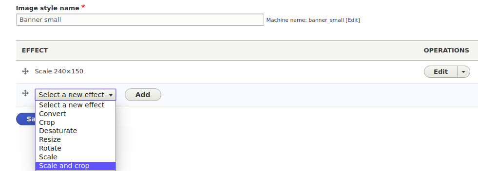
Step 3: Set up image styles for responsive images
Now let’s create an image style for each of the breakpoints. You can configure your own image styles at Admin -> Config -> Media -> Image-styles.
Click on ‘Add image style’. Give a valid name for your image style & use the Scale and crop effect which will provide cropped images. If the images are stretched, add multiple image styles for different viewports.
Step 4: Create a responsive image style for your theme
This is where you provide multiple image style options to the browser and let the browser choose the best out of the lot.
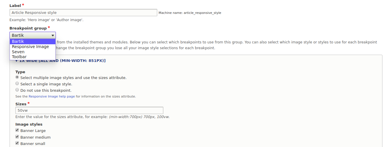
To create a new responsive Drupal 9 image style, navigate to:
Home -> Admin -> Config-> Media-> Responsive-image-style and click on ‘Add responsive image’.
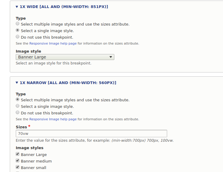
Give a valid name for your responsive image style and then select the breakpoint group (choose your theme). Next, assign the image styles to the breakpoints listed.
There are multiple options for the image style configurations.
- Choose single image style: Where you can select a single image style that will be rendered on the particular screen
- Choose multiple image style: Where you can select multiple-image style and also specify the viewport width for the image style
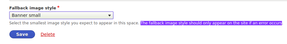
In the end, there is an option to select a fallback image style. The fallback image style should only appear on the site if an error occurs.
Step 5: Assign the responsive image style to an image field
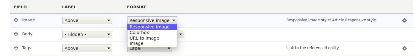
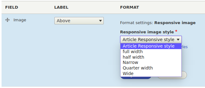
Once all the configurations are done, move to the image field by adding the responsive image style. To do that go to the field’s Manage display section and select the responsive image style that we created previously.
Now add content and check the results on the page with a responsive image style.
Final Results
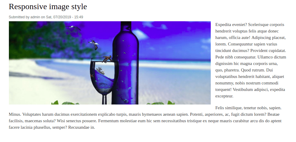 Image at a minimum width of 1024px (For Large Devices).
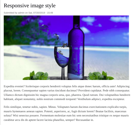
Image at minimum width of 768px (For Medium Devices).
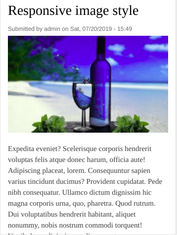
Image at maximum width 767px (For Small Devices).
Final Thoughts
Image optimization has been a major challenge for websites that want to be more responsive. You either have to let go of the image quality or increase the page load time. But with the Drupal 9 Responsive Images module and the Breakpoints module (now in core!), you can now scale or crop images at any breakpoint for different resolutions.
Are you looking for a proven Drupal development company to build impressive responsive Drupal websites? We’d love to help! Talk to us today.
Akshay Devadiga
Related Insights

Don't Miss Out!
