When Layout Builder was introduced in Drupal 8.6 and stabilized in Drupal 8.7, it created a drift in the page building mechanism being used in Drupal’s ecospace. Layout builder gave tough competition to other tools like Paragraphs, Brick, Panels, and Display Suite. Its unique ability to drag and drop components and preview them real time was a real concession for a page builder tool and for the authors.
However, despite being a prodigious tool for building pages it has its shortcomings when used for enterprise applications which requires a better authoring capability, restricted selections, quick access, and more importantly granular permissions for different user roles.
In this article, I will be covering 10 Drupal contributed modules which can be used in conjunction with the brilliant Layout Builder module that will make the tool more fascinating and authoritative. To add to this awesomeness, all these modules and compatible with Drupal 9 too!
The modules are divided into certain categories:
- Styling - Ability to provide access to the editor to choose from a style library which can be applied to sections and blocks.
- Authoring experience - Enhance the authoring experience of the editors which they will love.
- Reusability - Provision to reuse components or sections on different pages to reduce page building time.
- Quick Access - Provide quick access to the editors to perform certain actions thus saving time.
- Permissions - Give restricted access to editors or other user roles based on their access.
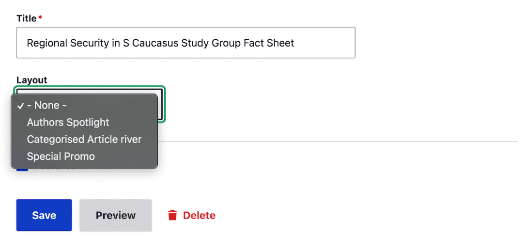
Layout Builder Styles
The Layout Builder Styles is a powerful Drupal module that allows you to add styles to the blocks and sections right from the UI. It can be used to provide the authors the capability to choose from a list of preset styles defined in the backend.
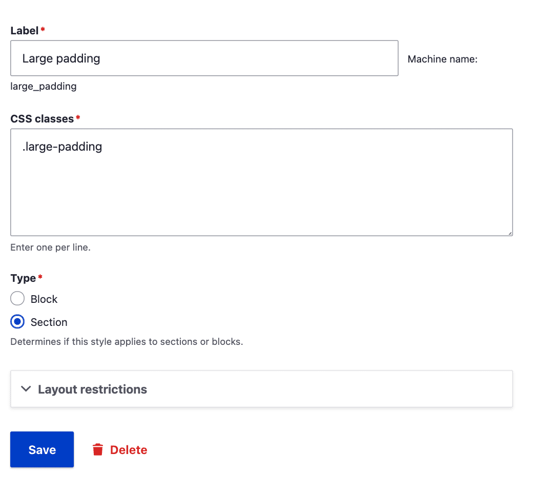
A "style" is just a representation of one or more CSS classes that will be applied. Additionally, for blocks, a block template suggestion is added for the selected style.
The styles are basically configuration entities which contain the CSS classes. The classes being added in the configuration must be defined in the frontend theme stylesheet for them to reflect on the frontend when applied to a particular section or a block. There is a provision available for having multiple styles which can be applied to a single block or section.
Since the styles are stored as configuration, they can be easily exported to configuration files using Drupal configuration management.
However, you must be responsible while adding styles as you are giving a powerful capability to the authors to alter the styles of the components being placed in a page. If not planned properly, things might go south with conflicting styles.
Layout Builder Component Attributes
The Layout Builder Component Attributes module provides similar provision to authors but with more options and it is only for the blocks being placed in a Layout.
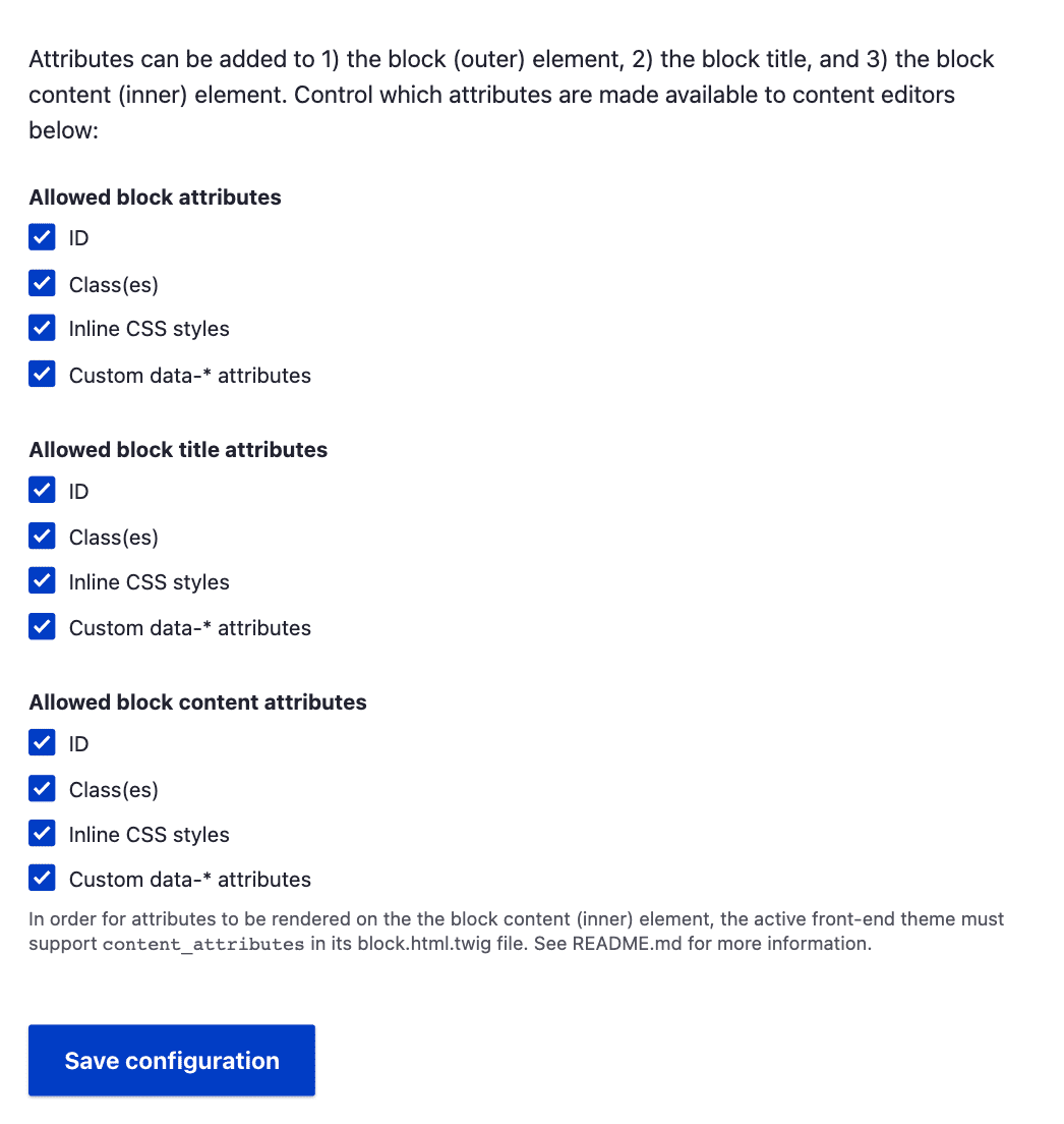
Oftentimes, authors need to add certain data-attributes or certain CSS Classes/IDs to a block to render the data in a certain way. There are modules available for such cases like Block attributes and Block class but they either lack the support of Layout Builder or need patching to work. The Layout Builder Component Attributes module gives the options to add these details as attributes to the blocks right in the Layout Builder UI out of the box.
The modules provide options ID, Class(es), Styles [inline styles to the block], Data-* attributes. These attributes can be added to 1) the block (outer) element, 2) the block title, and 3) the block content (inner) element. The options are configurable for each element types i.e. if you don’t want the ID field to be available for block titles those can be unchecked in the modules configuration form at
“/admin/config/content/layout-builder-component-attributes”
Layout Builder Modal
Drupal’s Layout Builder Modal module modernizes the UI and authoring experience for the block configuration forms or creation forms (in case of inline blocks). The form displayed on the off-canvas dialog sidebar can get really cumbersome because it is very narrow. Especially if you are dealing with complex fields, rich text fields, media references, etc. The off-canvas dialog greatly reduces the usability and is not ideal for such situations.
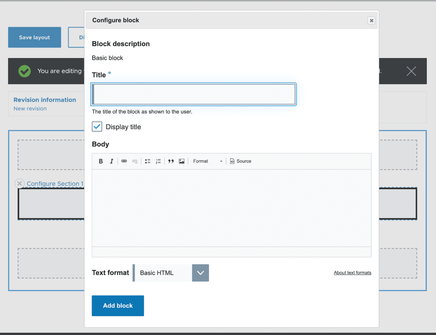
The module opens the forms in a popup window where there is a good amount of breathing space and increased usability. There are configurations available where you can set the width and height of the modal popup window. You can also select which theme to use for the modal content where you can either choose the default enabled themes (Olivero in case of the above screenshot) and the good old Seven administration theme. Currently, Claro is not supported but there is work going on in this front to make Claro available as an alternative.
Overall, the module greatly enhances the authoring experience for editors and the usability of Layout Builder.
Layout Builder Library
Let’s consider a situation where the editors need to quickly set up a page where they need to show certain content block components based on certain criteria e.g., selection of particular taxonomy terms. Now, this can be done in a hard way that editors create a landing page and then create the same layout again and again for multiple pages with the same content but different conditions. Or else, use the Layout Builder library module.
The Layout builder library modules provides the site administrator with the capability to create predefined layouts for each entity-type and bundle combination. Now, these layouts will be available to the site editors while creating the Landing page content. This will make the task much easier and faster where the editors will not have to redo the same task repeatedly. The module also provides granular permissions to restrict editors to create their own bespoke layouts but give them the ability to customize layouts on a per-content-item basis.
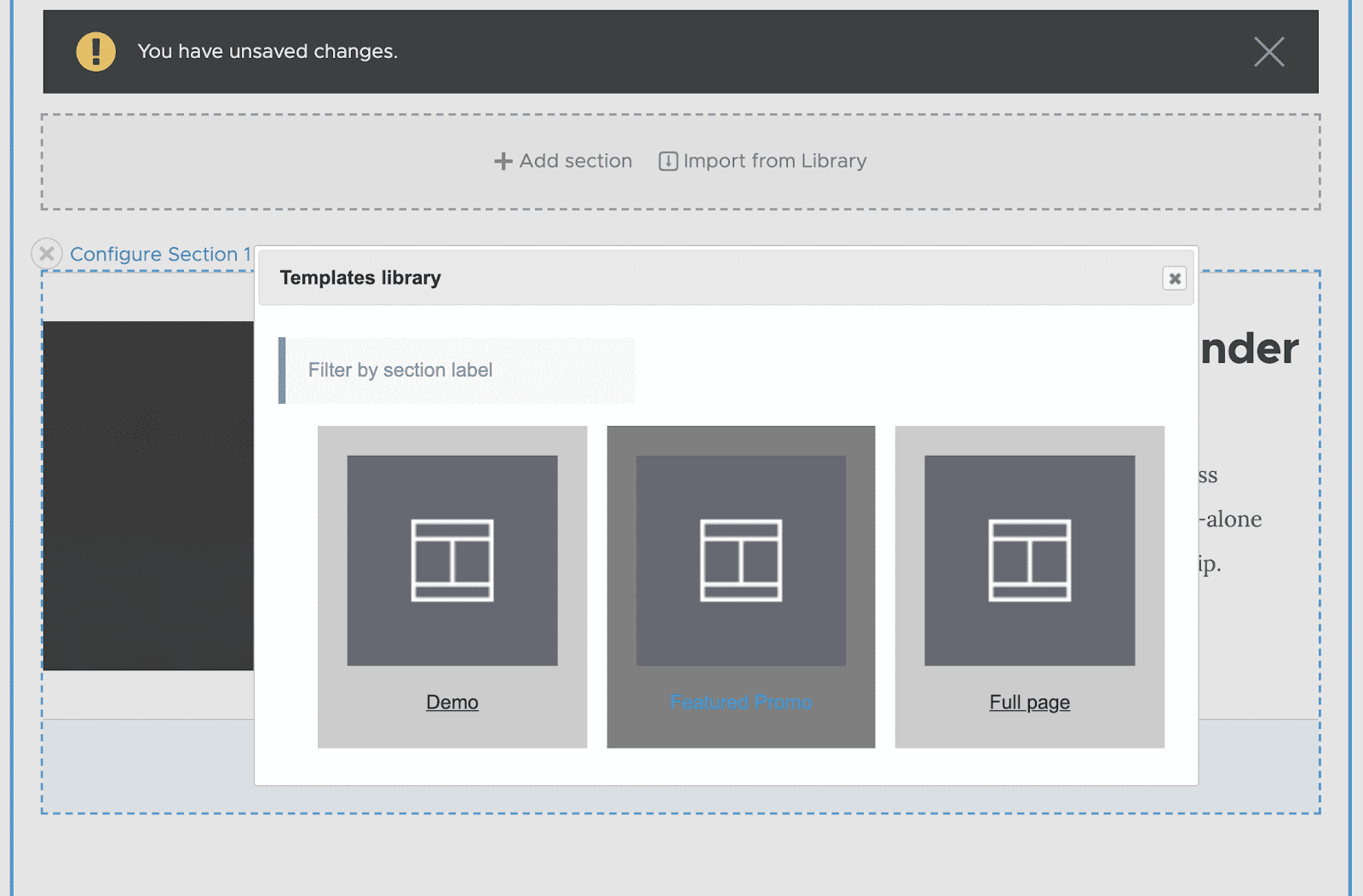
Section Library
Similar to the situation above mentioned where editors might need to choose from existing layout from a library, there can be a circumstance where editors will have to reuse certain sections from Layout Builder on multiple pages. This is where the Section Library comes into play. With the module, editors can create their own mini layouts which they can reuse on other pages. This allows them to create pages faster without again, repeated doing the same stuff.
The key difference between this module and the Layout Builder Library module is that the latter builds a full-page template and is config-based. The Section Library is content based so the content editor can create templates on the fly without import/export configs, also it builds templates for the section or multiple combined sections (page) templates.
There is no overlapping between the two modules, and you can use both at the same time.
Layout Builder Direct Add
One of the key features of Layout Builder is the ability to add inline blocks which are one off non-reusable blocks specific to a page. Now if the pages in your system mostly depend on these inline blocks as components, the Layout Builder Direct Add can save some editor's time by saving a few clicks.
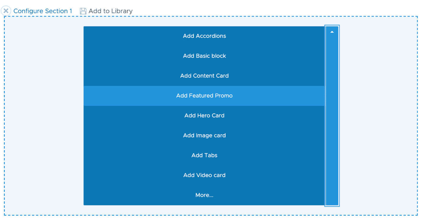
The module simple replaces the “Add Block” button with a quick dropdown button to the block types available in the system with a “More” option which opens the off-canvas dialog sidebar. When an editor selects any of the block types from the list it directly opens the block form to create that component.
Layout Builder Operation Link
This small module is a good to have feature for a site. To access the Layout Builder UI for an entity an editor needs to visit the page and then click on the Layout tab in the taskbar. The Layout Builder Operation Link adds a Layout option the dropdown button to contents in the content overview page.
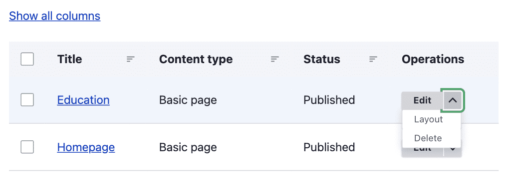
The layout option will show up for all the entity type bundles where Layout Builder is enabled. This link saves content editors a click/page load when they want to access an entity's layout page directly without loading its edit page first.
Layout Builder Restrictions
Out of the box, Layout Builder will list out all the blocks available in the system provided by various plugins and modules, fields are available as blocks and there are inline blocks options to create one-off blocks. Apart from that all the layouts provided by other modules and the theme also lists out when a section is being placed. This can be a little confusing and overwhelming for editors and poses a usability problem since the number of blocks can quickly grow in an enterprise application.
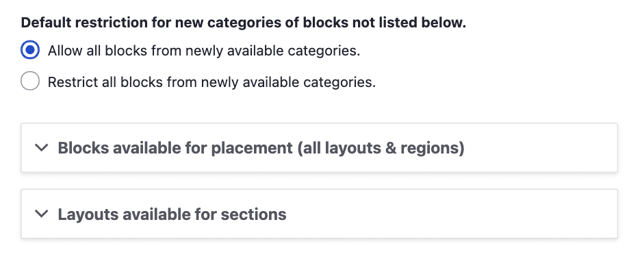
Layout Builder Restrictions solves this problem by providing a configurable layout with options that are needed. These options will be present whenever Layout Builder is enabled for any entity display. The module configurable UI for allow-listing/deny-listing blocks and layouts. Sites can allow all options from a certain provider, or restrict all options by provider, or specify individual allowed blocks & layouts. Site administrators can allow/deny those blocks that are useful for editors to build the pages and only those blocks and layouts will be available for the editors to choose from.
Layout Builder Advanced Permissions
Although Drupal provides a powerful permission system for user roles, there can be possibilities of more granular permissions based on the roles. The situation may arise when there are multiple user roles interacting with the system and pages.
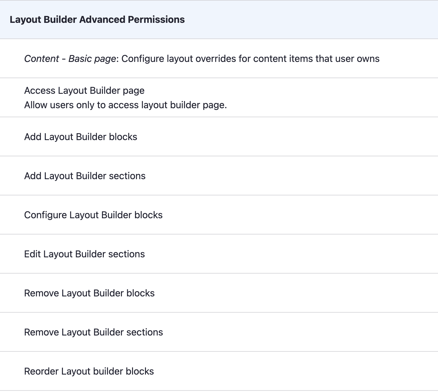
The Layout Builder Advanced Permissions module gives that capability to the site administrators to provide restricted permissions to use based on their role. These permissions are global which are applied across all entity types where Layout Builder is enabled. To take things further and restrict access on a cruder level, Layout builder lock will come handy which will be covered in the next section.
Layout Builder Lock
As mentioned above, the Layout Builder Lock will provide a cruder access for users. It allows administrators to lock sections of a default layout so users can't perform certain actions when overriding the layout for an individual entity.
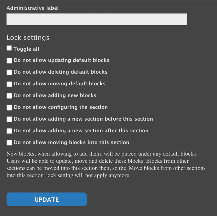
These lock settings will be available when the module gets installed and will be available for all sections. There are global permissions available to manage the access of the lock features. These are advanced editorial features which should be added and used very responsibly. Locking out a section, or any component inside a section means that the section will have very limited access for changeability.
Quick Recap
- Layout Builder Styles - allow site builders to select from a list of styles to apply to layout builder blocks and layout builder sections.
- Layout Builder Component Attributes - allows editors to add HTML attributes to Layout Builder components (blocks).
- Layout Builder Modal - lets you add and configure existing blocks in a modal in the Layout Builder UI.
- Layout builder library - provides a layout library allowing content editors to pick from a list of predefined layouts.
- Section Library - create reusable templates for single or multiple sections.
- Layout Builder Direct Add - replaces the "Add block" link with a drop-button that lists custom block types.
- Layout Builder Operation Link - adds a 'Layout' operation link to Layout Builder-enabled content on Drupal administrative pages.
- Layout Builder Restrictions - set which blocks and which layouts should be available for placement in Layout Builder.
- Layout Builder Advanced Permissions - allows to control in details access to the Layout builder page by providing a more granular permissions set.
- Layout Builder Lock - allows administrators to lock sections of a default layout so users can't perform certain actions when overriding the layout for an individual entity.

Malabya Tewari
Related Insights


Don't Miss Out!

